Charity
Donation-first collection flow
- Preset amount buttons and default donation amounts for fast collection.
- Custom title, subtitle, logo, and action text from app settings.
- Receipt sending, history filters, and simple reader-led payment flow.
PayX Hub is the mobile payment layer behind our Android apps, Stripe Terminal flows, branded donation screens, business dashboards, custom quick amounts, receipts, and account switching.
2
Operating modes: charity collection and commercial payments.
Tap
Built around Stripe Terminal reader discovery, collection, capture, and receipts.
Field
Runs branded Android builds for real organisations using PayX in the field.
PayX Mobile
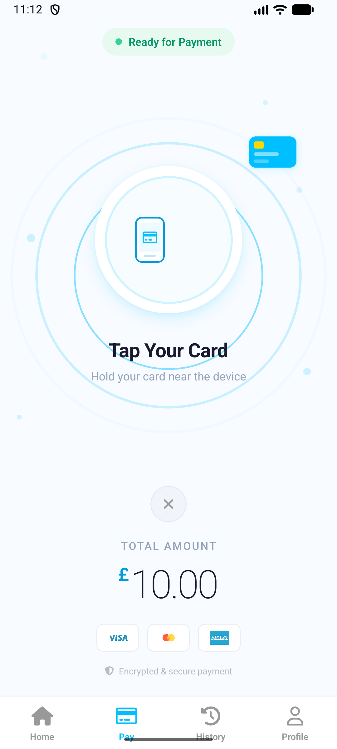
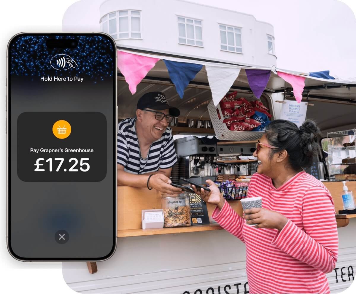
Tap to pay with live account context
Live PayX Flow
Tap card payment capture
Reader Flow
Discover, connect, collect, confirm, and capture from the same mobile experience.
Brand Control
Theme colours, logos, amount presets, and receipt settings sync with the app context.
Actual Product Context
The public site should explain what the product really does. PayX is not only a generic gateway. It supports distinct front-of-house flows for organisations collecting donations and businesses taking payments.
Charity
Commercial
Operational Flow
From onboarding to reader discovery, account switching, transaction capture, and branded receipts, the product is mobile-first and operationally focused.

Users sign in, select charity or commercial mode, and land in a layout tailored to the payment context.
The app supports Stripe Connect for commercial users and legacy secret-key flows where needed, then initializes reader discovery and terminal collection.
Payment capture, transaction history, notifications, app settings, amount presets, and receipt delivery all sit inside the same operational surface.
Brand Layer
Logos, theme colours, and receipt content come from app settings instead of fixed copy.
Download Surface
Organisation-specific Android builds are already part of the product story, not an afterthought.
Deployment
The site should connect the marketing message to the real delivery model: dedicated Android builds, institution-specific branding, and a shared backend and dashboard.
Request organisation access
Use the contact page to request branded deployments and controlled app distribution.
Sign in to manage
Use the dashboard to manage users, Stripe accounts, transactions, and settings.
Public App Listing
PayX Hub on Google Play
The official public Android listing for PayX Hub is live on Google Play. Use it for the main app install, then use the download centre for organisation-specific APK builds.

Actual App Screens
The landing page should show the actual flow, not a dense gallery. This carousel highlights the commercial dashboard, payment keypad, reader selection, card tap flow, transaction history, mode switching, and charity donation screen with focused copy.
Screen 1 of 7
Current Screen
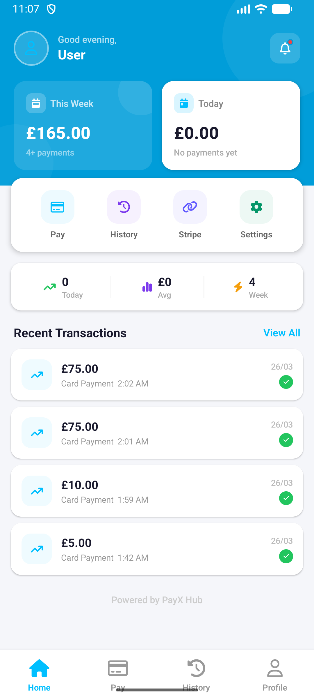
Weekly totals, quick actions, recent payments, and active bottom-tab navigation.
Why this matters
Shows the operational state users actually see in the field, rather than a stylised marketing mockup.
What it shows
Commercial collection, charity donation, reader setup, payment capture, and history views from the real app.
Browse All Screens